 How to resolve AdBlock issue?
News
- Details
- Written by: LAKE COUNTY NEWS REPORTS
The Lake County Water Resources Department, partnering with the U.S. Fish and Wildlife Service and consultants at Creative Resource Strategies, invites the public to attend a virtual forum to discuss how the county will respond in the event invasive quagga or zebra mussels become introduced or established in Clear Lake.
The forum will be held at 10 a.m. Thursday, Feb. 2, via Zoom.
Click here to register.
Anyone that has a business or residence in Lake County, and/or values or recreates on Clear Lake or other lakes in the county is encouraged to participate in the webinar.
Clear Lake is the largest natural freshwater lake located entirely in California, and consistently ranks among Bassmaster’s top 10 bass fishing lakes.
Although Clear Lake provides ideal water quality conditions and habitat for an established mussel introduction, Clear Lake currently has no quagga or zebra mussels.
Lake County relies on a prevention program supported primarily through state grants. Local mussel stickers are also sold.
Clear Lake is the county's central feature, providing economic and ecological stability to the entire region.
However, the popularity and accessibility of Clear Lake, combined with water quality conditions optimal for mussel establishment, mean risk of invasive mussel invasion is extremely high.
The Feb. 2 webinar will share information on the invasive mussel rapid response and containment transition project, which is intended to improve the current Clear Lake aquatic invasive species program while preparing for an invasive mussel introduction to Clear Lake or Lake County.
The webinar will share the goals of the project and the approach that will be taken to achieve those goals, the timeline and products.
A containment and transition plan, feasibility analysis for permanent watercraft decontamination stations, and assessment of regulations and ordinances are three key outcomes.
Information regarding consequences to Clear Lake and neighboring lakes from a mussel invasion will also be shared, including potential impacts to county revenue and property values, effects on native fish and wildlife, and increased costs and maintenance for all water suppliers and self-supplied water users.
By preparing for an invasion, the county is seeking to mitigate effects to the local economy and natural resources.
The county said the commitment of local residents, boat ramp monitors, and county, state and federal agency personnel has been critical to preventing quagga and zebra mussel introduction in Clear Lake.
“Continued vigilance and collective action is essential; relenting in this important effort could invite far-reaching environmental and economic harm,” the county said in a statement on the meeting.
Information about the project can be found here.
The recording of the webinar will be posted here.
If you have any questions or need more information, please contact the Water Resources Department at
Also visit the Water Resources Departments’ website or the Lake County Water Resources Department Facebook page, @lakecountywater.
- Details
- Written by: LAKE COUNTY NEWS REPORTS
Stormwater runoff from recent rains has washed trees and other floating debris into the Clear Lake.
The Lake County Water Resources Department advises county residents and visitors to take caution to avoid such hazards when boating.
Some logs appear small on the surface; please be aware, they could be mostly submerged.
Lake County Water Resources Department advises boaters to maintain a safe speed and keep a clear line of vision ahead of their vessel, especially in dusk and dawn hours, when light is limited.
The Water Resources Department will patrol the lake and remove hazardous floating debris. However, boaters should remain alert and aware of their surroundings as more rain and debris flow is expected.
Contact the Lake County Water Resources Department at 707-263-2344 if you have questions or concerns about lake debris.
- Details
- Written by: Craig Benson
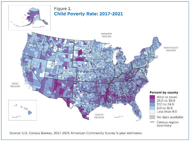
Poverty rates for children (under age 18) in U.S. counties are wide-ranging, from less than 1.0% to 72.7%, according to the American Community Survey (ACS) 5-year estimates.
The U.S. Census Bureau’s 2017-2021 ACS differs from the 1-year estimates released in September because it pools five consecutive years of 1-year estimates. This allows us to estimate poverty in geographies with smaller populations, including all 3,143 counties in the United States.
This article focuses on the poverty rates of the nation’s youngest and oldest age groups at the county level. It also analyzes the change in rates from the 2012-2016 ACS to the subsequent period of 2017-2021.
According to the new estimates, the national child poverty rate declined from 21.2% in the 2012-2016 period to 17.0% in the 2017-2021 period. But it was still 4.4 percentage points higher than the ACS national overall poverty rate of 12.6% during the same period.
In contrast, the poverty rate (9.6%) of people ages 65 and older during the 2017-2021 period was 3 percentage points lower than the overall rate.
How poverty is measured
Government agencies, researchers and local organizations regularly use poverty estimates to measure economic well-being and identify the number of individuals and families eligible for various assistance programs.
Poverty status is determined by comparing annual income to a set of dollar values (called poverty thresholds) that vary by family size, number of children and age of the householder.
The poverty threshold differs for individuals and families of different sizes.
A family and each individual member of that family are considered in poverty if the family’s before-tax money income is less than the dollar value of its threshold. Poverty status of people not living in families is determined by comparing an individual’s income to their poverty threshold.
The poverty measure excludes children under the age of 15 who are not related to the householder and people living in institutional group quarters, college dormitories or military barracks. Population totals in this article include only those whose poverty status can be determined.
Child poverty by county and region
Only 117 (or 3.7%) of the nation’s counties – more than half with a poverty universe population of less than 10,000 – had poverty rates of 40% or more. The majority (81.2%) of them were in the South.
Conversely, 302 U.S. counties, 9.6% of all counties, had a child poverty rate below 8%. Nearly half (146) of them were in the Midwest.
Figure 1 illustrates the uneven distribution of child poverty in U.S. counties.
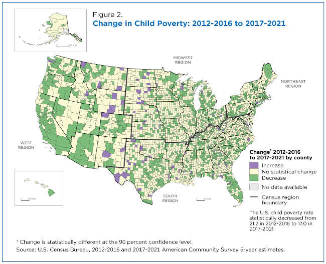
Change From 2012-2016 to 2017-2021
Child poverty rates changed significantly in 1,104 counties from 2012-2016 to 2017-2021 (Figure 2):
• Child poverty rates declined in 1,017 counties.
• 43% of counties with declining child poverty rates were in the South.
• Child poverty rates increased in far fewer counties (87). Over half were in the South.
Poverty rates of older populations by county and region
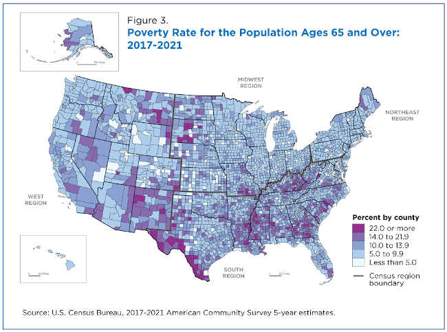
The poverty rate for people ages 65 and over increased from 9.3% in 2012-2016 to 9.6% in 2017-2021 but rates varied widely across counties – from less than 1.0% to 47.9%.
As with child poverty, there were regional clusters of high- and low-poverty counties (Figure 3).
There were 201 counties with less than 5.0% of individuals ages 65 and up in poverty; 41.8% of them were in the Midwest.
Conversely, there were 76 counties with poverty rates at or above 22.0% for people ages 65 and over; 73.7% of them were in the South.
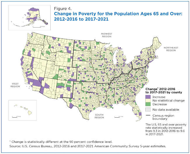
From 2012-2016 to 2017-2021, 513 counties experienced a significant change in poverty rates for people ages 65 and over: 282 counties had an increase, and 231 counties a decrease (Figure 4).
Of the counties with declining rates, nearly 200 (86%) were in the South or Midwest. Within individual regions, 8.4% of all counties in the South had declining poverty rates; 7.6% in the Midwest; 6.0% in the West; and 2.3% in the Northeast.
Of the counties with increased rates of poverty among people ages 65 and over, 39.4% were in the South. Regionally, 14.8% of all counties in the Northeast had increasing rates compared to 11.6% in the West; 8.2% in the Midwest; and 7.8% in the South.
More counties saw poverty rates among older populations increase than decrease from 2012-2016 to 2017-2021, the opposite of the pattern seen among children.
Poverty rates among the 65-plus population increased in 282 counties from 2012-2016 to 2017-2021. Of these counties, 108 experienced declines in child poverty rates and five increases in poverty rates in both age categories.
Of the 231 counties with declining poverty rates for those 65 and over, 88 also had declining child poverty rates and four had increases.
In the Northeast, 0.9% of counties had an increase in child poverty rates but 14.8% of counties showed an increase in the poverty rate of those ages 65 and over. Similarly, only 2.7% of counties in the West had an increase in child poverty rates but 11.6% had an increase in poverty rates of the older population.
Additional poverty data are available at data.census.gov and this topics page provides links to poverty estimates from other surveys such as the Current Population Survey Annual Social and Economic Supplement (CPS ASEC) and the Survey of Income and Program Participation (SIPP). Small Area Income and Poverty Estimates (SAIPE) are also available.
Craig Benson is a survey statistician in the Census Bureau’s Poverty Statistics Branch.
- Details
- Written by: Dariush Mozaffarian, Tufts University; Jeffrey B. Blumberg, Tufts University; Paul F. Jacques, Tufts University, and Renata Micha, Tufts University

Many people aim to start the year off with healthier food choices. But how do you choose between seemingly similar foods, snacks or beverages? How does a bagel with cream cheese compare to toast topped with avocado, for instance? Or a protein-based shake compared to a smoothie packed with fruits? Or two chicken dishes, prepared in different ways?
As nutrition scientists who have spent our entire careers studying how different foods influence health, our team at Tufts University has created a new food rating system, the Food Compass, that could help consumers and others make informed choices about these kinds of questions.
Food rating systems explained
Many such systems exist and are widely used around the globe. Each one combines facts about different nutritional aspects of foods to provide an overall measure of healthfulness, which can be communicated to consumers through package labels or shelf tags. They can also be used to help guide product reformulations or socially conscious investment goals for investors.
Examples of common systems include Nutri-Score and Health Star Rating – widely used in Europe, the U.K., Australia and New Zealand – and “black box” warning label systems, which are increasingly used throughout Latin America.
All such food rating systems have strengths and limitations. Most aim to be simple, using data on just a few nutrients or ingredients. While this is practical, it can omit other important determinants of healthfulness – like the degree of food processing and fermentation and the presence of diverse food ingredients or nutrients like omega-3s and flavonoids, plant compounds that offer an array of health benefits.
Some systems also emphasize older nutrition science. For example, nearly all give negative points for total fat, regardless of fat type, and focus on saturated fat alone, rather than overall fat quality. Another common shortcoming is not assessing refined grains and starches, which have similar metabolic harms as added sugars and represent about one-third of calories in the U.S. food supply. And many give negative points for total calories, regardless of their source.
Enter the Food Compass
To address each of these gaps, in 2021 our research team created the Food Compass. This system assesses 54 different attributes of foods, selected based on the strength of scientific evidence for their health effects. Food Compass maps and scores these attributes across nine distinct dimensions and then combines them into a single score, ranging from 1 (least healthy) to 100 (most healthy). It incorporates new science on multiple food ingredients and nutrients; does not penalize total fat or focus on saturated fat; and gives negative points for processing and refined carbs.
We have now evaluated 58,000 products using Food Compass and found that it generally performs very well in scoring foods. Minimally processed, bioactive-rich foods like fruits, veggies, beans, whole grains, nuts, yogurt and seafood score at the top. Other animal foods, like eggs, milk, cheese, poultry and meat, typically score in the middle. Processed foods rich in refined grains and sugars, like refined cereals, breads, crackers and energy bars, and processed meats fall at the bottom.
We found Food Compass to be especially useful when comparing seemingly similar food items, like different breads, different desserts or different mixed meals. Food Compass also appears to work better than existing rating systems for certain food groups.
For example, it gives lower scores to processed foods that are rich in refined grains and starch and to low-fat processed foods that are often marketed as healthy, like deli meats and hot dogs, fat-free salad dressings, pre-sweetened fruit drinks, energy drinks and coffees. It also gives higher scores to foods rich in unsaturated oils, like nuts and olive oil. Compared with older rating systems, these improvements are more aligned with the latest science on the health effects of these foods.
We also assessed how Food Compass relates to major health outcomes in people. In a national sample of 48,000 Americans, we calculated each person’s individual Food Compass score, ranging from 1 to 100, based on the different foods and beverages they reported eating.
We found that people whose diets scored higher according to Food Compass had better overall health than those with lower scores. This includes less obesity, better blood sugar control, lower blood pressure and better blood cholesterol levels. They also had a lower risk of metabolic syndrome or cancer and a lower risk of death from all causes. For every 10-point higher Food Compass score, a person had about a 7% lower risk of dying. These are important findings, showing that, on average, eating foods with higher Food Compass scores is linked to numerous improved health outcomes.
Fine-tuning
While we believe Food Compass represents a significant advance over existing systems, more work is needed before it can be rolled out to consumers.
As one step, we’re investigating how the scoring algorithm can be further improved. For example, we’re considering the most appropriate scoring for food items like certain cereals that are high in whole grains and fiber but are also processed and have added sugar. And we’re looking at the scoring of different egg, cheese, poultry and meat products, which have a wide range of scores but sometimes score a bit lower than may make intuitive sense.
Over the coming year we will be refining and improving the system based on our research, the latest evidence and feedback from the scientific community.
In addition, more research is needed on how a consumer might understand and use Food Compass in practice. For example, it could be added as a front-of-pack label – but would that be helpful without more education and context?
Also, while the scoring system ranges from 1 to 100, could it be more accessible if scores were grouped into broader categories? For instance, might a green/yellow/red traffic light system be easier to understand?
And we’re hoping that future Food Compass versions might contain additional criteria to filter foods for people who follow special diets, such as low-carb, paleo, vegetarian, diabetic-friendly, low-sodium and others.
The big picture
Food Compass should not be used to replace food-based dietary guidelines and preferences. Raspberries and asparagus score really well – but a diet of only these foods would not be very healthy. People should seek a balanced diet across different food groups.
To help, Food Compass may be most useful to compare similar products within a food group. For example, someone who prefers eggs for breakfast can look for higher-scoring egg dishes. Those preferring cereal can look for higher-scoring cereals. And even better, Food Compass can help people add other highest-scoring foods to their plate – like veggies and healthy oils to eggs, and fruit and nuts to cereal – to increase the overall health benefits of that meal.
To make use by others as easy as possible, we’ve published all the details of the scoring algorithm, and the scores of the products evaluated, so that anyone can take what we’ve done and use it.
Stay tuned – as we complete additional research, we believe Food Compass will become an important tool to clear up confusion in the grocery store and help people make healthier choices.![]()
Dariush Mozaffarian, Dean of Friedman School of Nutrition Science and Policy, Tufts University; Jeffrey B. Blumberg, Professor Emeritus in Nutrition Science and Policy, Tufts University; Paul F. Jacques, Professor of Nutrition Science and Policy, Tufts University, and Renata Micha, Associate Professor in Human Nutrition, Tufts University
This article is republished from The Conversation under a Creative Commons license. Read the original article.